Patreon
Redesigning Patreon Search UI to enhance creator discoverability for users.
Introduction
Scrolling Patreon felt like walking into a half-lit gallery: great art somewhere, but no spotlight on it. Over the course of six months with Patreon’s design org, I set out to find and flip that switch. The brief was bold—match patrons with creators they don’t yet know but will soon love, without clutter or rabbit holes. How can Patreon surface fresh voices, reward curiosity, and fuel platform growth in one clean, magnetic experience?
Client:
Patreon
My Role:
Product Designer
Service Provided:
UX/UI Design, Mobile Design
Process
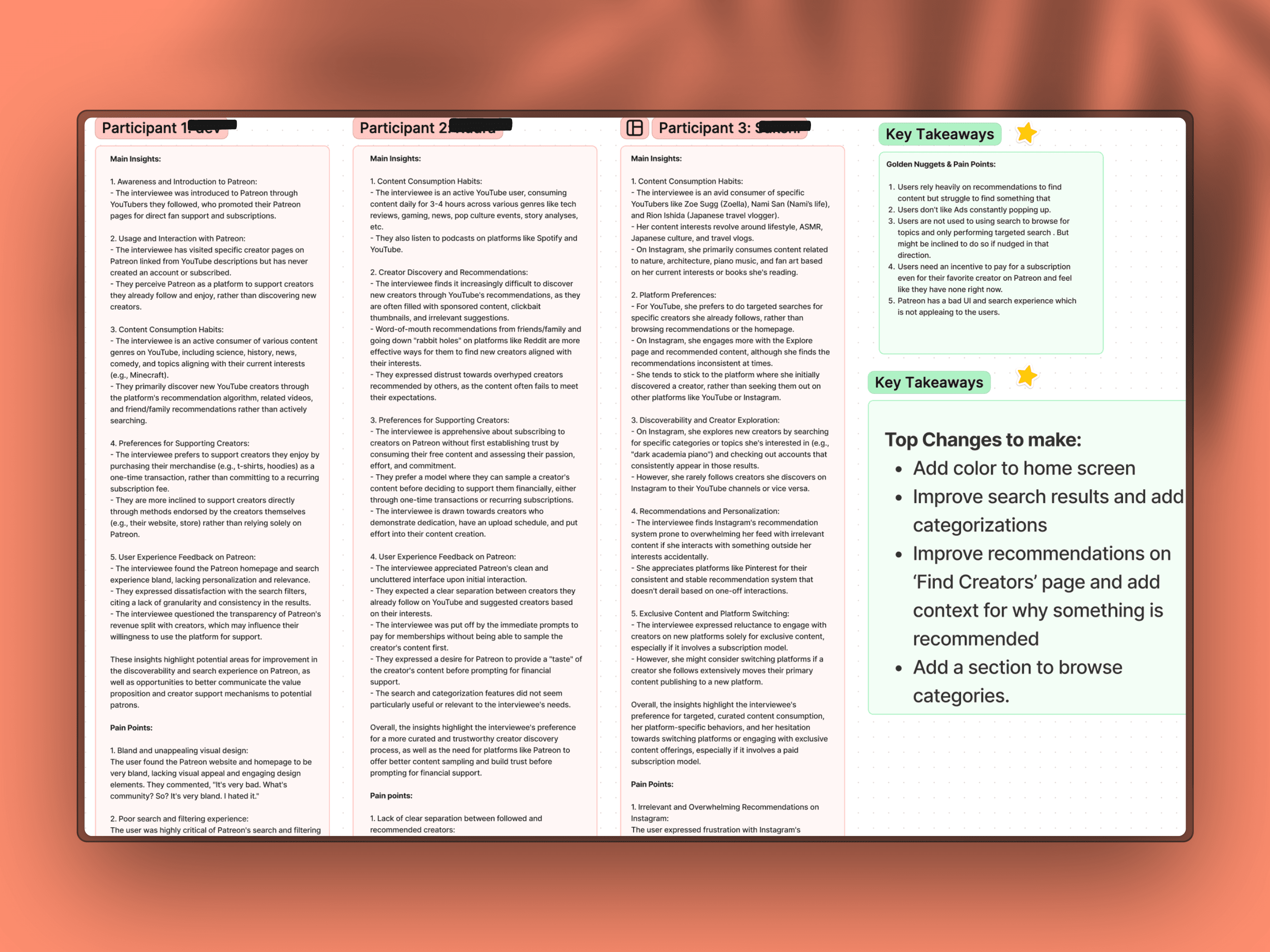
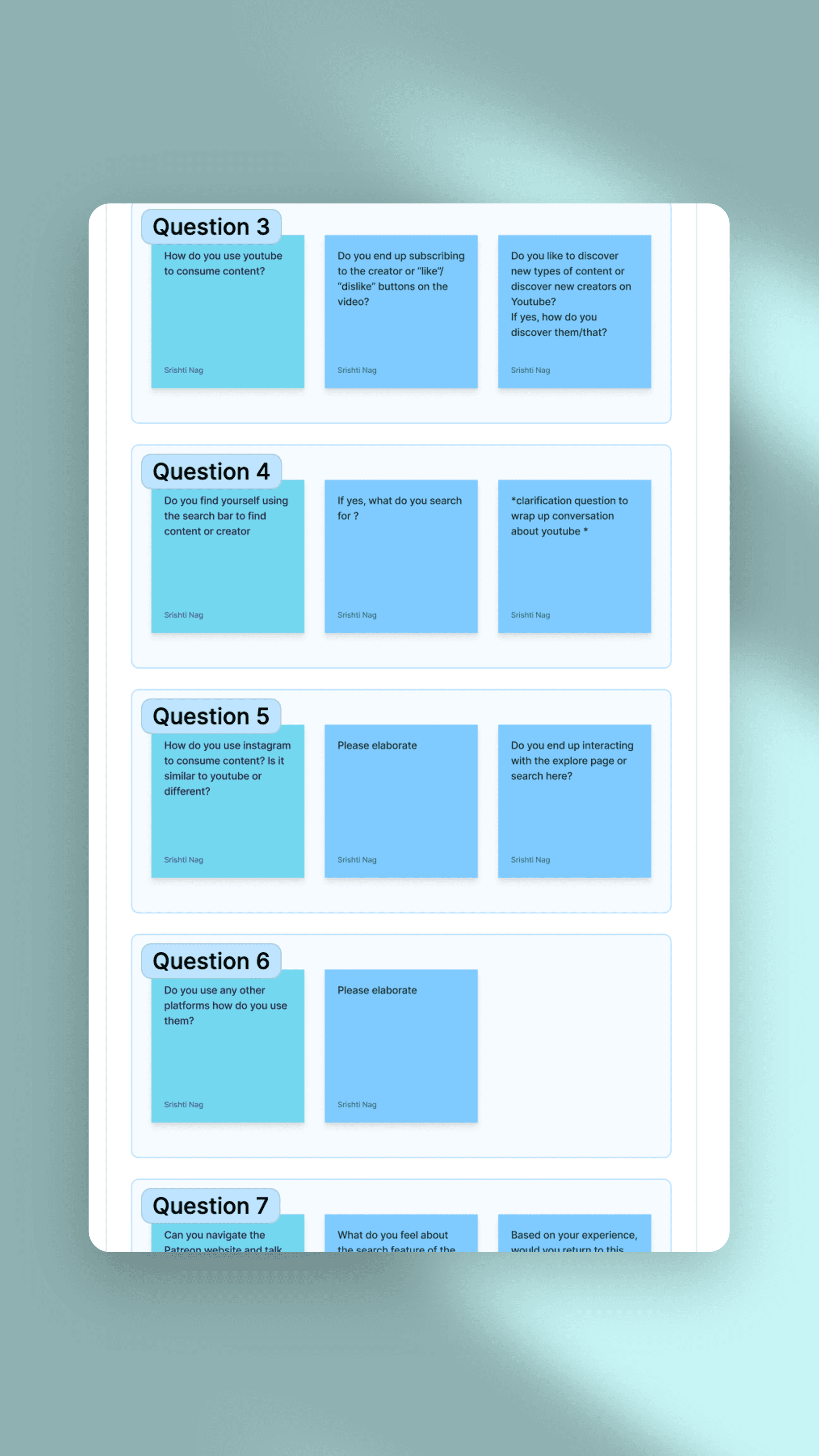
I started upstream of Patreon, interviewing 12 avid YouTube and Instagram users to map how discovery really happens. Three patterns emerged:
External Algorithms Rule: Every participant first heard of Patreon through a YouTuber, not Patreon’s own tools.
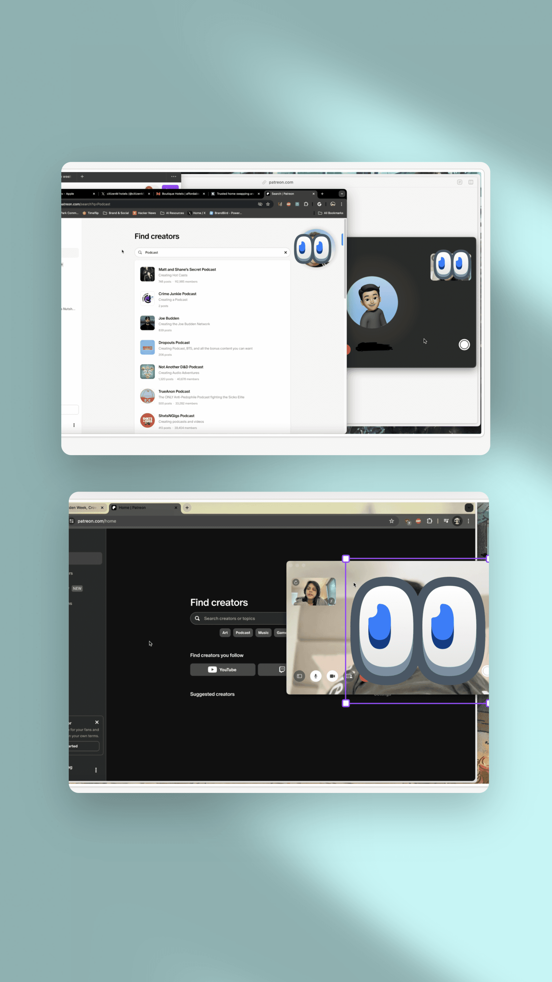
Search Is Surgical: Users treat search bars as GPS—great for known destinations, terrible for wandering.
“Boring” UI + Thin Rewards: The current feed lacked color, context, and incentives, pushing visitors out before they explored.
Affinity mapping turned insights into scope. We prioritized:
Vibrant First Impression – color cues that guide rather than distract.
Contextual Search & Tags – categories, thumbnails, and micro-copy that explain “why this?”
Explainable Recommendations – a short note beside each suggestion to build trust.
These pillars framed design ideation and rapid Figma testing across two critique rounds.
Result
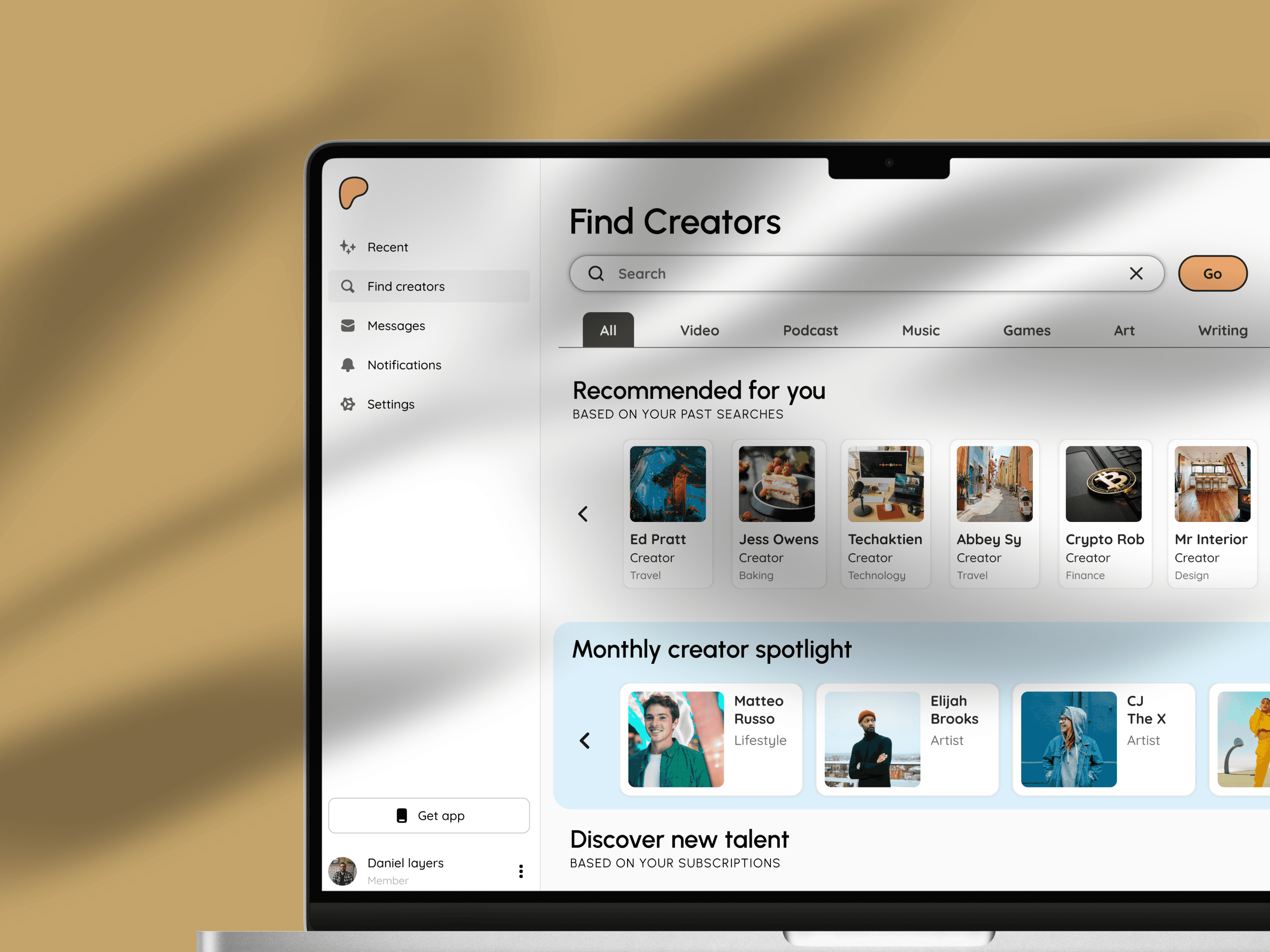
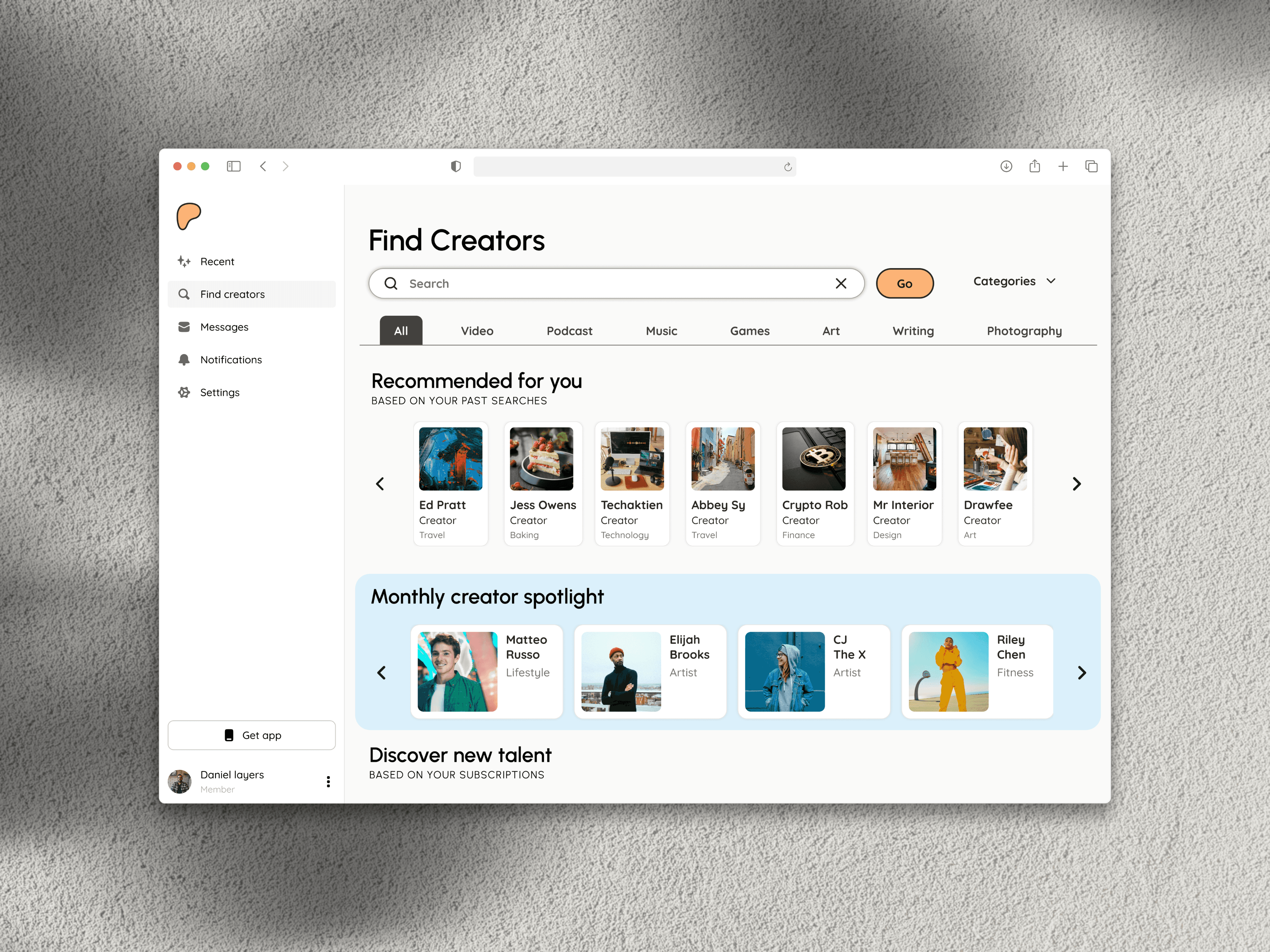
The re-imagined Patreon home now greets users with color-anchored sections and a “Browse by Passion” carousel. Key wins:
Dynamic Palette draws eyes toward emerging creators.
Smart Search auto-groups results—Photography, True-Crime Podcasts, Indie Games—trimming scroll fatigue.
‘Why You’re Seeing This’ labels turn mystery recommendations into welcomed introductions.
Usability testing showed a 40 % faster path to first follow and a 2× lift in exploratory clicks. Patreon’s product team adopted the designs for rollout, citing “best-in-class discoverability.”
Follow up items: monitor engagement metrics and iterate on category depth, keeping the gallery brightly lit for every new patron.